A visually captivating logo in poster format
The Bereum logo design reflects brand philosophy in health and eco-friendly living. With its fresh color palette, modern layout, and nature-inspired imagery, it captures attention while reinforcing Bereum’s commitment to sustainability and elegance.
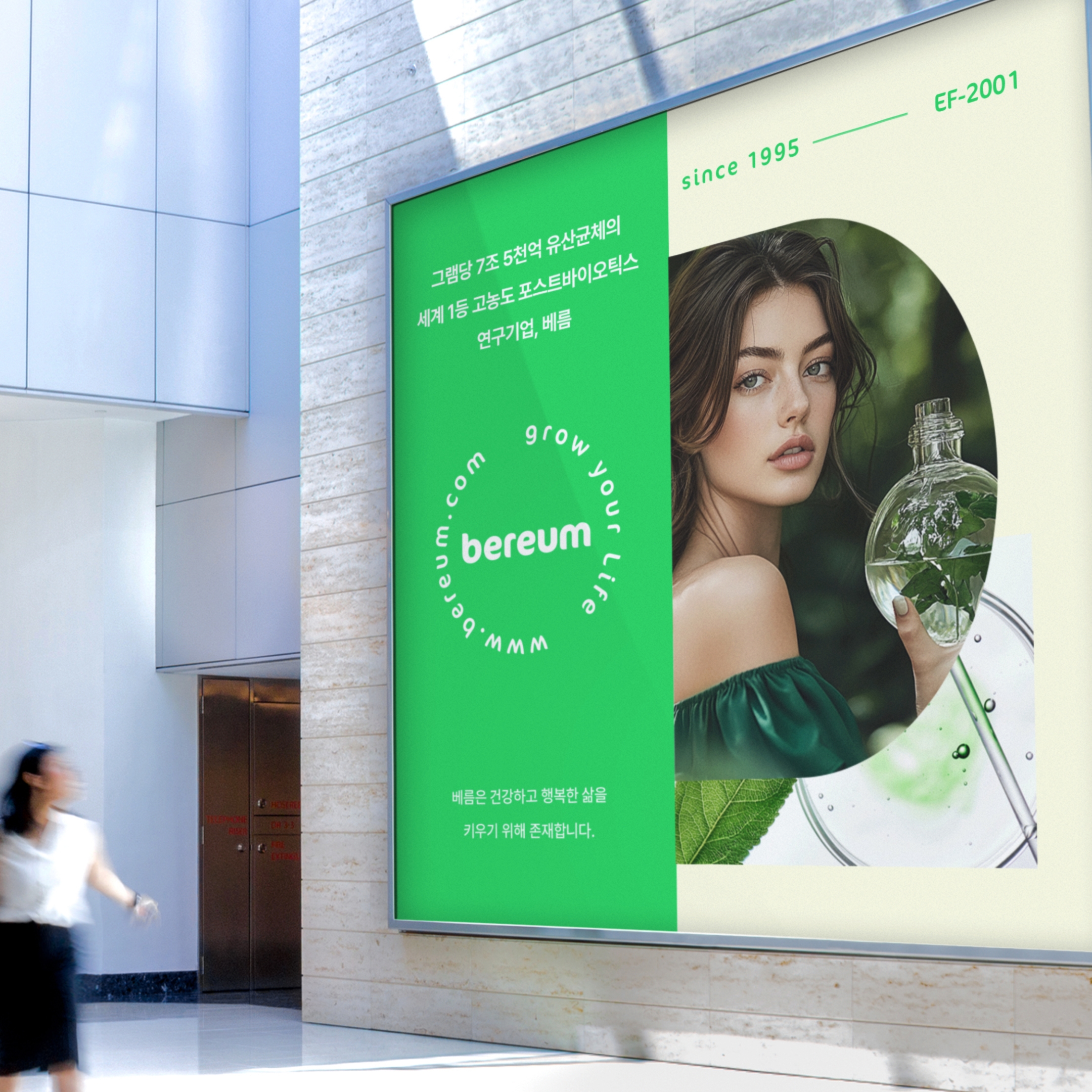
Customer Request:
The client wanted a poster design that would showcase Bereum’s brand identity as a premium, eco-conscious skincare company. The logo on poster needed to communicate trust, sustainability, and elegance, while seamlessly blending the brand’s core messaging with a modern aesthetic. Additionally, the design was intended to attract attention in a high-traffic, indoor setting, such as a mall or exhibition space.
What We Focused On:
We emphasized a clean and modern layout with a vibrant green color palette to represent sustainability and nature. The circular logo placement draws attention to the brand identity, while the imagery of the woman holding a glass bottle symbolizes purity and the eco-conscious mission of Bereum. Subtle typography was used to convey the brand’s tagline and establish its credibility (e.g., “Since 1995”). The design balances elegance and approachability, ensuring it appeals to environmentally aware, premium-focused consumers.